Each year, those in the know offer their predictions for color trends and what is to come. Sometimes those predictions turn out to be accurate. Sometimes… not so much. This year the colors have been predicted, and you may be surprised at where we are heading.
Since the beginning of this decade, trending colors have been gradually drifting away from the ever-popular gray tones that permeated so many homes during the previous decade.
Based on trends from around the world, it looks like the overall palette recommendation is following closely with each other. However, each paint brand is pointing to a slightly different shade for this year’s choice.
Sherwin William’s 2022 Color of the Year
Evergreen Fog is a grayish-green color that can take on slightly different hues with different lighting.
Depending on the time of day, the color can look grayer. And while the undertone is definitely green, it can skew a bit more towards a bluish hue if given the right light.
The colors paired with it can also have an effect on the final tone. Be sure to view a sample of this in your home through the day before making your final decision.
Evergreen Fog has a light reflective value of 30. It pairs well with Sherwin William’s accessible beige, urban bronze, woven wicker, Uber Umber
This color is fast becoming a favorite for Kitchens. Check out all of my predictions for upcoming kitchen trends for this decade.
Benjamin Moore’s 2022 Color of the Year
October Mist is a softer shade of green. Like Evergreen Fog, it is also an earthy tone that leans away from the recently popular cool grays.
If you’re looking for a new neutral, this sage green shade could be just the color for you. It is a mid-tone green with a light reflective value of 46.
Pair October Mist with Benjamin Moore’s Steam, Collector’s Item, Gloucester Sage, or Natural Linen.
Behr’s 2022 Color of the Year
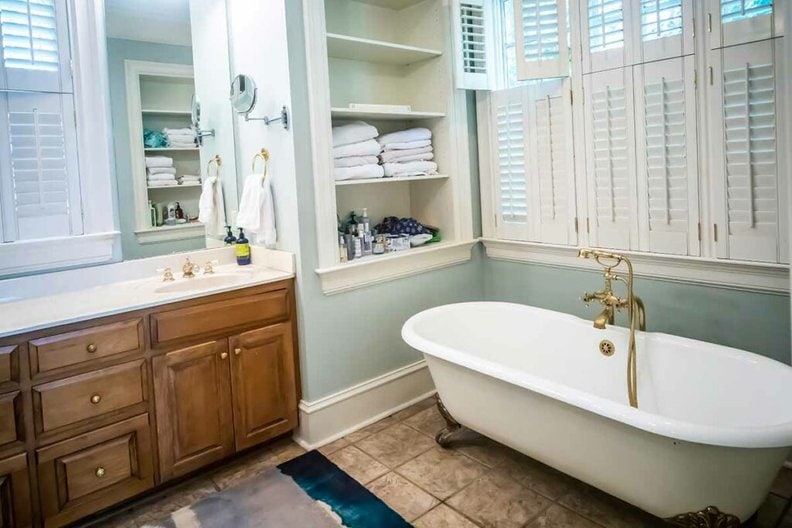
Breezeway is the outlier in color predictions this year. While still technically within the green family of colors, Breezeway is more of a light minty green.
It is a cool shade that may be appealing to those who are not ready to embrace the warmer earthy tones that are currently trending.
This color is perfect for those who want that cool coastal feel. In bathrooms, it creates that light, airy, spa setting.
Breezeway has a LRV of 66. Pair it with Behr’s whisper white.
Final Comments:
Predictions are speculative, at best. If these colors don’t appeal to your sense of design, I wouldn’t worry about it too much. Changes in home trends are usually slow to saturation and take a while to exit the market.
That means those gray colors are probably going to hang around for several more years to come. If these new predictions turn out to take over the market, there will be plenty of time to ride that wave without having to jump in right away.
I always suggest to everyone to choose colors based on what they love rather than what is trendy. That is unless you are planning to put your home on the market. In which case, I suggest taking a look at the paint colors most likely to increase your sale price.
Along that same line of thought, I would suggest taking a look at the colors most likely to turn off buyers. You would want to avoid those paint colors.
Want to see how accurate previous predictions were? Check out the year’s gone by.
Previous Colors of the Year
Behr’s 2020 Color of the Year
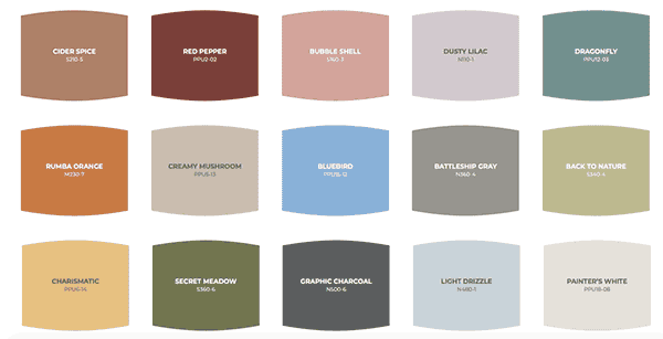
Behr is predicting that their nature-inspired color palette is the direction that both residential and commercial designs are heading. It includes several color options of warm earthy tones. Is this an indication that we are swinging back towards gold neutrals? hmmm…
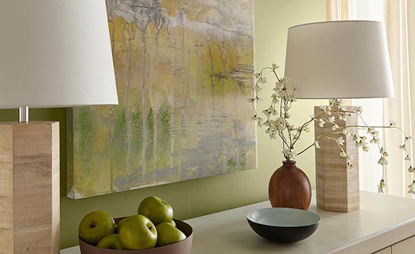
From that palette, they have named their Back to Nature as 2020’s color of the year. It is a muted green tone that invokes a calm and soothing space.
In the past, I have not always agreed with color trend predictions, but this year I think they may be onto something. I can easily see this color being used in today’s Craftsman-style homes.
Sherwin Williams 2020 Color of The Year
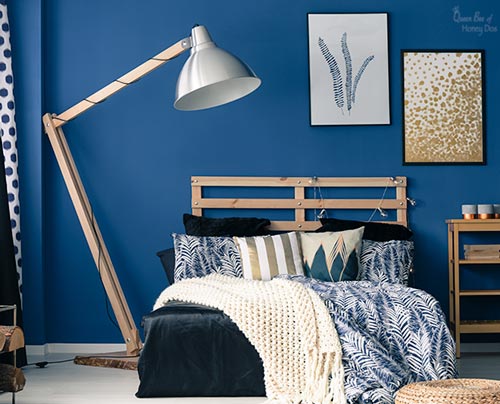
Sherwin William’s has named Naval as their color of the year for 2020. This one has actually been gaining in popularity for the past few years.
A stroll through Instagram’s more popular designers shows this color frequently appearing in kid’s rooms, as accent ding room walls, and as a growing choice for cabinet color.
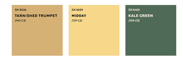
In addition, Sherwin William’s recommends three other color choices as pairings. Notice anything? Hint – these colors are very similar to some from Behr’s palette. It also is leaning heavily into these warmer tones.
Benjamin Moore’s 2020 Color of the Year
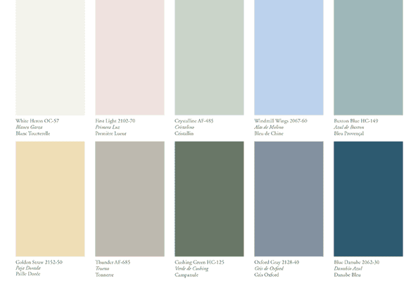
Benjamin Moore, while including a whole pallet that tracks very closely to Behr’s pallet, is going in a different direction for their call-out color.
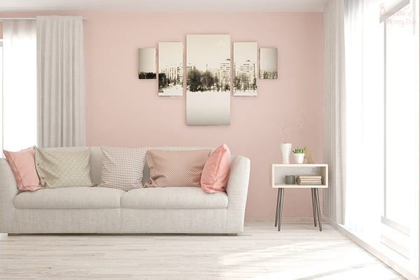
They have chosen First Light as 2020’s color of the year. This is a soft pink color that has some gray undertones and is reminiscent of Pantone’s 2016 choice – Rose Quartz.
First Light is a nice neutral for anyone who wants to go in a different direction from the frequently used gray and beige options.
2019
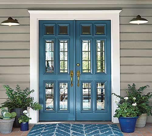
Behr 2019 color of the year is very similar to Sherwin William’s choice for 2018. A muted but jeweled tone color, Blueprint is sure to be a great accent color.
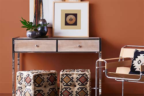
For 2019 Sherwin Williams is taking a serious step toward a more traditional warm tone. Cavern Clay is an orange rust color that mimics what we see in terra-cotta.
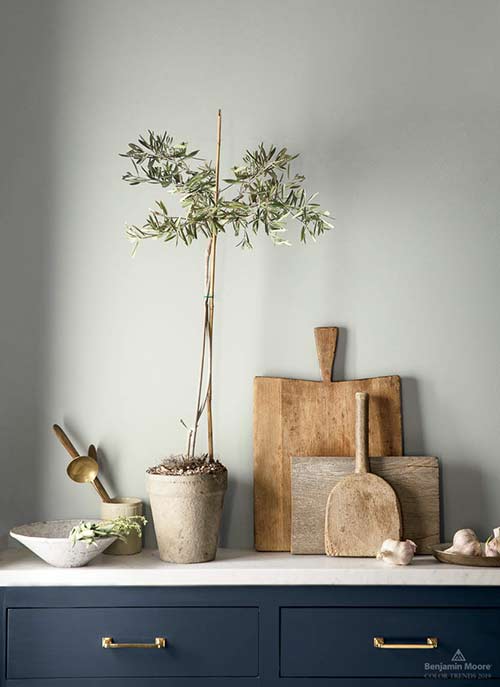
Benjamin Moore is sticking with the ever-popular gray neutrals for this year’s color of the year. Metropolitan is a sleek neutral gray that pairs well with navy blue shades.
2018
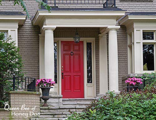
Remember the 90’s dining rooms? Red paint was a very popular choice in homes. Well, Benjamin Moore is predicting a return of the red trend, but not just any old red.
Caliente, BM 2018 color of the year, is a bold but mid-ranged red. It is neither extremely cold (blue undertones) nor does it lean heavily towards that orangey, red color of the ’90s.
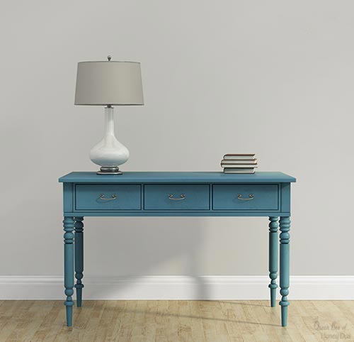
Sherwin William’s Color of the year is a marine-inspired, jewel-toned, aquamarine color. It is called Oceanside and can definitely evoke a tranquil setting.
Expect to see this color show up on kitchen cabinets and furniture pieces. It also makes a nice feature color.

This year, Pinterest is getting into the color predicting game. Based on their search trends, they are predicting a new neutral – Sage! One of the best options for a sage color is Sherwin William’s Evergreen Fog (seen above)
Sage is basically a green that has been muted almost to the point of being gray (for cool shades) or beige (for warm tones). I have actually used variations of sage for many years as a nice neutral paint.
If you are one of those people who like to stick with walls in whatever neutral tone is currently popular, then sage is a great way to add some variety.
2017 Pantone’s Color of the Year…Greenery
FYI – I no longer include Pantone in my color-of-the-year write-ups, but you can still see the colors from 2017 and prior years. The reason for this is that Pantone typically predicts their colors with commercial brands in mind.
These are colors that they predict to be popular and trending for the branding of the fashion and the packaging world. As such, it really doesn’t have anything to do with home interiors.
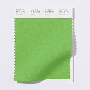
As you can see from the color swatch provided by Pantone, this green is a very outdoorsy sort of color. However, it is nothing like the warm earthy tones of the past.
Instead, think more of your veggie garden. This color would blend right in next to those leafy greens. From my perspective, this green is somewhere between lime green and celery green. So, let’s see how it looks on the inside.
2016 Pantone’s Color of the Year… Serenity and Rose Quartz
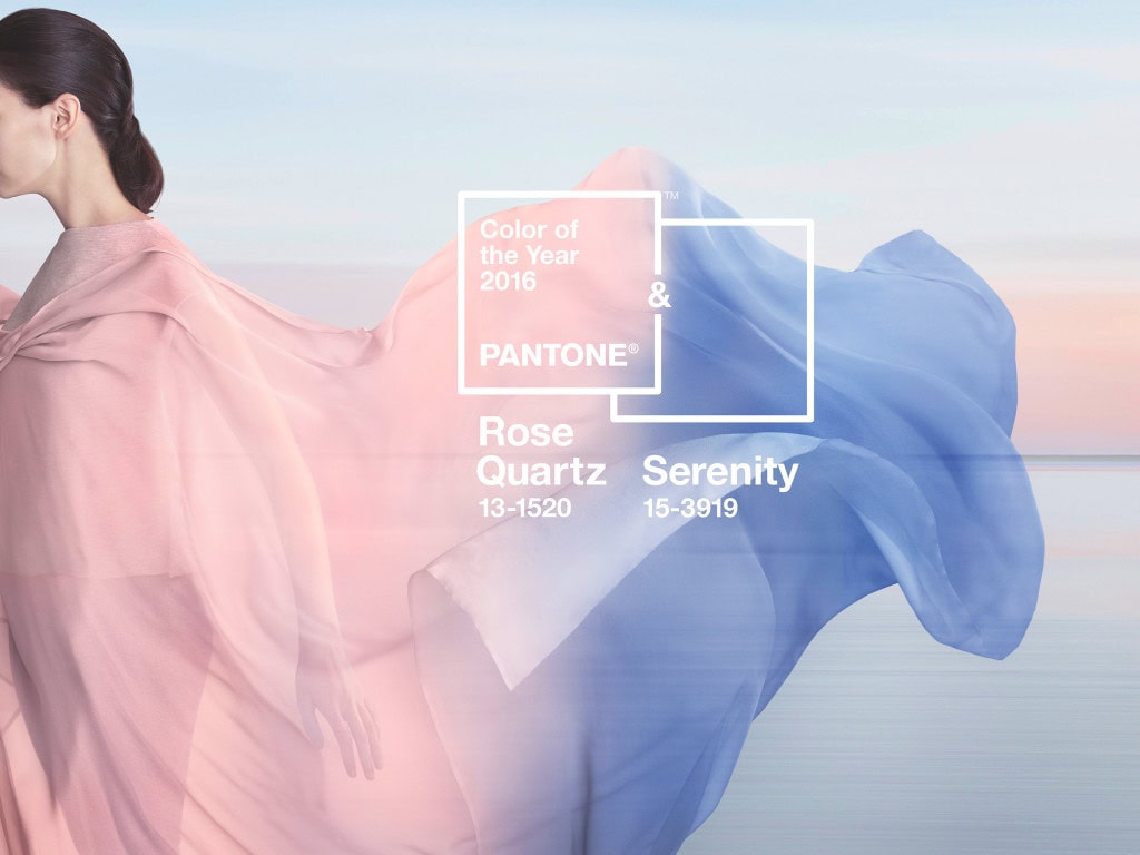
Serenity is a cool blue that has a bit of violet in it. I have heard it described as Sky Blue, Country Blue, Periwinkle, and Cornflower. I think that is because when seen in shades from dark to light, it really covers most of these hues. The biggest defining character of the shade is the purple/violet undertones.
This hue derives its name from the actual Rose Quartz stone. As you can see, there are a variety of shades within this material.
The color is a soft, almost antiqued pink that has undertones of brown. But don’t think this is your average little girl color. This shade can work in a lot of different rooms.

Above is the list of everything from 2010 through 2017. As you can see, none of these colors ever became a trend in home interiors. This time span was very saturated with gray paint colors.
Among those repose gray, amazing gray, and pewter gray were among the most popular and were known as the “new neutral” for this decade.


Please keep it clean. Comments that do not follow the Comment's Policy may be removed.